


Problem
When hikers are preparing for an adventure, they want to know what kind of trail conditions they can expect but sources for trail condition reports are often nonexistent, outdated, too general, or require cross-referencing multiple sources.
My role
On a highly collaborative 2-4 person team, I was responsible for leading product design, including UI and visual design, user research, usability testing, and branding.
Process
Learning from hikers
We conducted user interviews and an online survey with hikers to learn what they find helpful when planning hikes and while hiking, how they currently find trail conditions, and whether they’d use an app for this purpose, among other things. We learned that it was important for the app to let users:
Post reports quickly (people want to report what they’ve seen but not spend a lot of time on their phones while hiking)
Know that the information is accurate
Post intel offline
Be part of a community and follow up with questions/comments
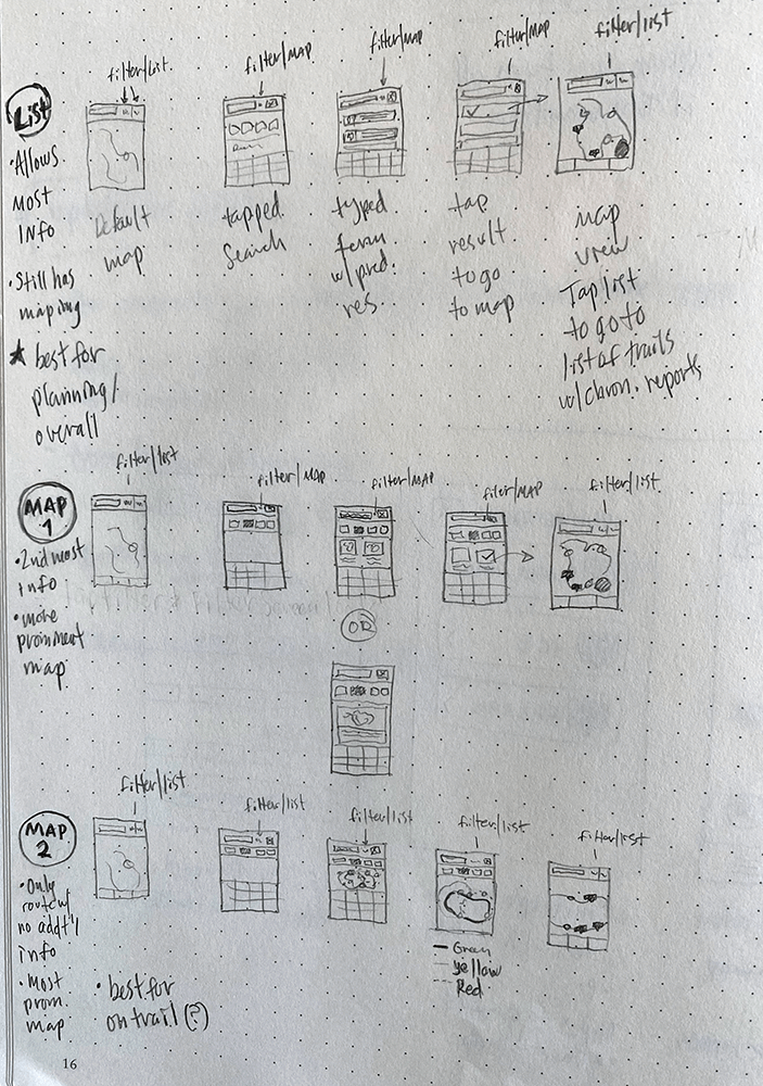
Sketching and wireframing
I then sketched several iterations of the core screens based on what we learned and on what we’d need to consider in terms of technical challenges. Each iteration was critically reviewed with the team and we reviewed with hikers a few times, too. A small sampling is below.


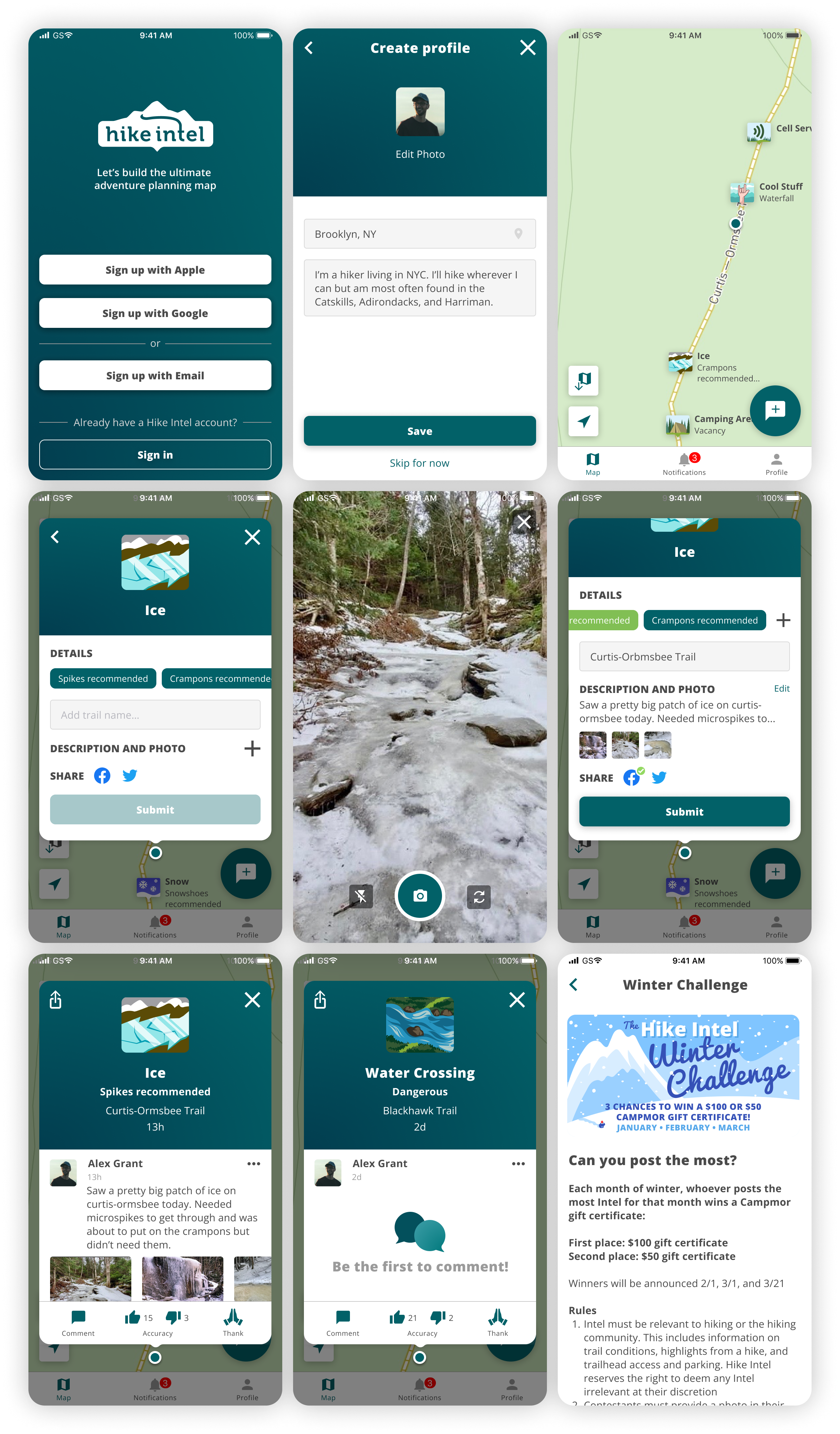
Using Figma, I built a lo-fi prototype for internal review and remote usability testing. The UX/UI I designed:
geolocates the report to the user, maintaining location accuracy for the report
lets users post in as little as 3 taps, which takes about 5-10 seconds
directly makes the conversation part of the report
A few sample wireframe screens:

Usability testing
I created the test-plan, moderator script, which included pre-test and post-test questionnaires, and scenarios, and then refined them with the team.
Using our prototype and Lookback.io, we held two remote usability testing sessions with hikers over a few days.
Then, we took about a week to analyze the feedback and create a basic report to consolidate the findings. Overall, people thought it was easy to post quickly, that the UI made condition-related discussions easy, and they trusted the accuracy of the information due to the photos, descriptions, and geolocation.

Usability testing feedback results
It was apparent from the feedback that we needed to cut some things, including entire features, from the app and we also saw some new opportunities. For example, I had wireframed a list view of condition reports and created multiple card-based screens, but users overwhelmingly preferred to just use the map to see reports, so we killed those while tweaking other parts of the UI. Also, since most users liked using photos, we created an additional flow that leverages the photos’ geotagged and timestamped metadata to accurately create a post even after they’ve left their hike - a good solution for hikers who’d rather not be on their phone a lot while hiking.
Branding, visual design, and design system
My main priorities in designing the visual identity for the brand were to have an attractive, modern look that differentiates us in the market while still leveraging color from the natural world (our bluish green is based on the Chlorociboria fungus and the green is based on moss). I conducted a competitive analysis and then did logo, palette, typography, and icon explorations. In order to read well in a variety of outdoor light settings and to be accessible, I created a fairly high-contrast visual design with a typeface known for accessibility.
I designed the icons (a small sampling shown below) to quickly convey the subject matter at a variety of sizes, to be easy to differentiate from one another (while still feeling like a cohesive style), and to feel fun!

I created an efficient design system in Figma for the app and evolved it throughout the project’s ongoing lifecycle.

^^ Hike Intel’s design system “Fungus” :) ^^
The final designs for the MVP netted out around 40 unique screens, and about 80 overall for the different interactive states of the screens (a small sampling below).
Outcomes & Results
After creating a Beta version and testing it with hikers, we made a several updates and submitted to the App Store, where it was accepted (with no changes)!
We used Firebase analytics and conducted several more rounds of research to learn new insights, which were incorporated into about 10 releases. Two substantial updates we made based on user research and validation included a new screen/flow for users to choose up front between posting during or after their hike, letting intel reports stay on the map longer.

The app was in the app store for a year and a half and had a 4.7 rating. Being a passion project with no funding, we unfortunately decided to pull it from the App Store, due to a lack of bandwidth and budget for the various design, development, and business activities needed for real growth.