Problem
Through user interviews, we learned that the top two challenges for users of the site were not being able to quickly find the products they use and that it was hard to stay aware of product status unless you were always logged in.
My role
I concepted and designed the experience, from hand sketches to the final visual design. I also wrote questionnaires and participated in user research, wrote user stories and business requirements, cowrote the UX copy, and helped with digital strategy. The team included the client, lead digital strategist, lead developer, lead account executive, copywriter, and hospital pharmacists.
Process
Our primary users work in hospitals in a variety of roles, so we visited 5 hospitals with our client to discuss their staff’s workflow and use of PfizerInjectables.com. After synthesizing the feedback w/ the team, it was clear that our goal was to provide users with more targeted, timely availability status with less effort on their part.
Registration
I redesigned the site registration to include an optional step where users could search for and add institutions they’re affiliated with in an interface that slides-left and then saves to the same registration form modal. I also added a section to their account page for updating their institutions. This was based on the discovery that Pfizer’s database can map an institution to the products it uses. This would allow users to filter and track products by what’s used at their particular institution(s) - a much quicker and more personalized experience than before.
I sketched a few iterations to work out a lot of the details, regularly reviewing with the team. Then, I proceeded into wireframes and a rough prototype to communicate the experience to stakeholders. Then I created the visual design by leveraging and expand the styleguide and designing some new iconography and graphics.
Alerts
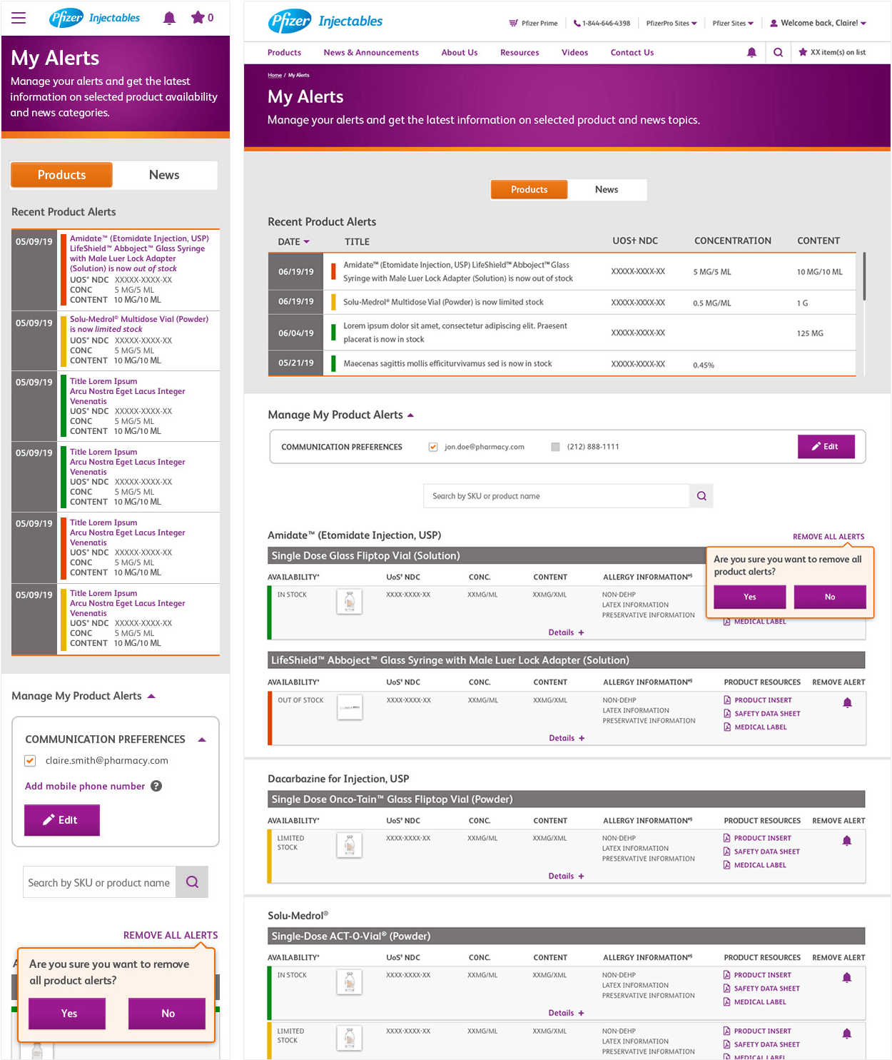
We made it easier to be aware of product status changes (a high priority based on our interviews) by letting users add an alert to any product on the site and by seeing, setting up, and managing alerts on the My Alerts page.
I again sketched the rough ideas, refining them with the team, and then did the wireframes and visual design. I also worked with developers and the SMS vendor to establish rules around the SMS alerts and email alerts. Users receive one daily sms and/or email alert (their choice) on any day that a product’s availability has changed or a news article has been published, and can see alerts in the browser tab and global header.
Outcomes & Results
Custom registration and alerts have recently launched and so far the metrics show that the goals our client established are being met. We’ve talked with the various hospital staff again and they are excited by the updates to the site. Post-launch interviews with them have revealed there’s more to be done, including potentially changing the behavior of the sticky header and adding product barcodes to the site for scanning.


